

Overview
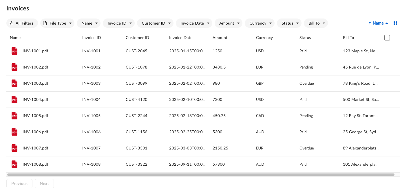
The metadata viewv2 is a ground-up redesign of the original metadata view of the Box Content Explorer UI element. It introduces a streamlined interface tailored for metadata-driven workflows. Key features include filtering and editing interfaces with dedicated UI for each metadata field type, flexible display options with list and grid views, pagination support, and more.
Prerequisites
Before implementing the metadata viewv2 of Content Explorer, ensure you have:
- The
box-ui-elementspackagev24.0.0+, Reactv18.0.0, andNode.jsv18.0.0+ - The Box Platform app with proper CORS settings
- A valid
- A configured metadata template applied to target folder or files. See or with the Admin Console.
Interface areas
The metadata view interface consists of the following areas:- Header – Displays the current view title, navigation, and context-sensitive information like selection counts. The header value can be specified with a
titleprop. If it’s not defined, it defaults to the folder name specified in theancestor_folder_id. - Action bar – Contains filter chips for each metadata field, sort options, and the view mode toggle button (list or grid).
- Pagination footer – Provides the Previous and Next navigation buttons and page indicators.
Display metadata view
To display the metadata view of Content Explorer, you need the following properties:
Depending on your needs and setup, Box UI Elements can be used with Vanilla JavaScript or React. You can learn more about installation from the guide.
Capitalized strings need to be replaced with your custom values.
Vanilla JavaScript code snippet
React code snippet
Columns
The columns prop defines the structure and behavior of your metadata table columns.Features
Enabling row selection
You can enable selecting individual rows. When one or more rows are selected, the header updates to show a selection descriptor and a metadata edit button. This allows users to perform single or bulk actions. Row selection is scoped to the paginated content.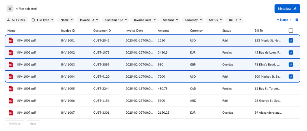
isSelectionEnabled property to true within the metadataViewProps object:
Editing metadata values
When one or more items are selected, the component header displays the selected count and the Metadata button becomes active. Clicking the Metadata button opens a sidebar that lets users view and edit metadata for the selected items.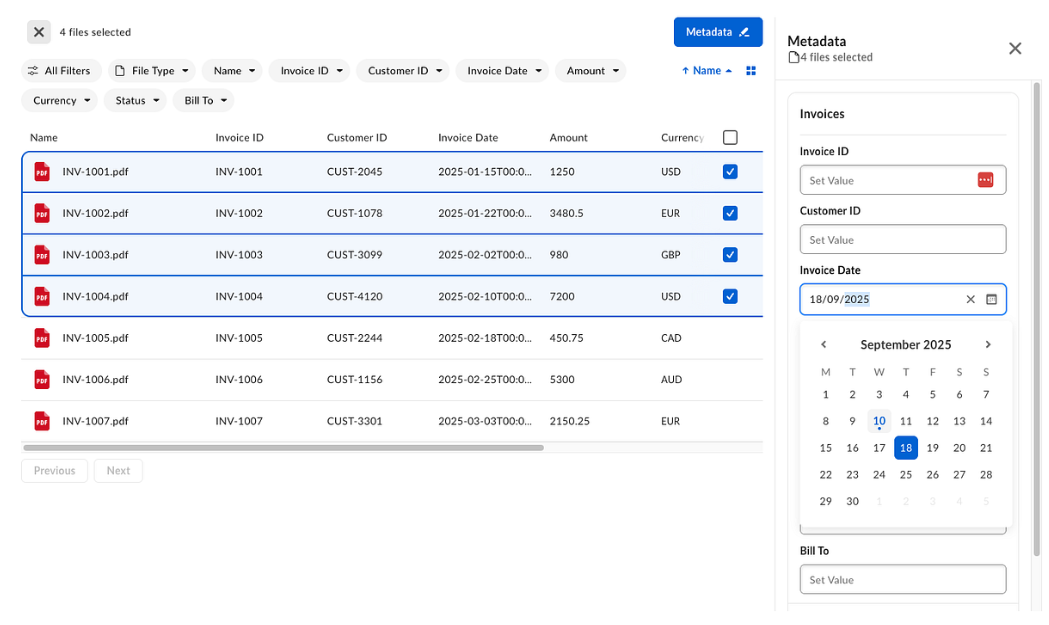
Filtering metadata
Filter items by the file type, filter folders, or filter by metadata field values specified in the Box . Filter chips are enabled by default. To disable the All Filters chip, set theisAllFiltersDisabled to true in the actionBarProps object:
Toggling list and grid view
Grid view is available by default through the view mode toggle button in the action bar. When the grid view is active, a zoom control becomes available. Other functionalities like selecting, filtering, and editing are also available within this view.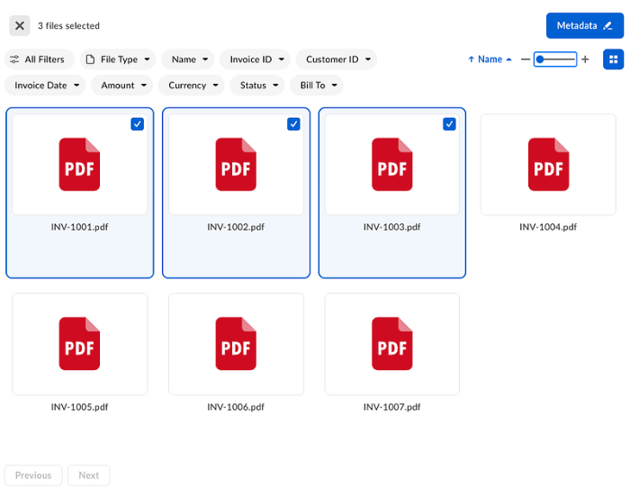
actionBarProps.isViewModeButtonDisabled to true within the metadataViewProps object:
Pagination
The UI Element uses marker-based pagination only, with the footer always visible. You cannot set an offset or page number. Users can navigate using only Previous and Next. Infinite scrolling is not supported.Migrating from v1 to v2
Npm package
The
v1 of the metadata view Content Explorer has reached end of support. While v1 remains available in the 24.0.0 package, it will no longer receive bug fixes or new features. Follow the migration guide and switch to the v2 metadata view of Content Explorer in order to receive the newest features.v1 to v2 in projects using box-ui-elements package:
- Upgrade the
box-ui-elementspackage version to version24.0.0or higher. - Ensure
box-ui-elementspeer dependencies are added as dependencies in yourpackage.jsonfile. Install them with your package manager. - Add the
featuresflag to enable the enhanced metadata view.
- Convert your metadata
fieldToShowconfiguration to the new column object. Add field types that correspond with the values in the Box metadata template. Pass the columns array to the newmetadataViewPropsobject.
- Optionally, configure additional features described in this guide.
CDN
To migrate fromv1 to v2 in projects using CDN imports:
- Ensure that CDN link includes package version with version
24.0.0or higher. - Add the
featuresflag to enable the enhanced metadata view.
- Convert your metadata
fieldToShowconfiguration to the new column object. Add field types that correspond with the values in the Box metadata template. Pass the columns array to the newmetadataViewPropsobject.
- Optionally, configure additional features described in this guide.