

Content Preview Element vs Content Preview Library
The Content Preview UI Element works differently from the other UI Elements, as the React component is a wrapper for the Box Content Preview library. It also requires passing a language (defaults toen-US) since the preview library bundles are localized.
Installation
Box UI elements either through NPM or the Box CDN.Authentication
UI Elements are designed in an authentication-agnostic way so whether they will work for Managed Box Users and non-Box users (App Users). The reason for this is that UI Elements only expect a for authentication, and Box provides two different ways to generate tokens - OAuth and JWT.Learn about selecting an authentication method
Supported File Types
Box Content Preview supports 120+ file types, including most document and image formats, HD video, 3D models, 360-degree images, and 360-degree videos. You can find the full list of supported file types here.Demo
Use the navigation arrows to preview different file types.API
Parameters
Options
Token Generator Function
The Preview library optionally takes a token generator function instead of a string token. Using a token generator function allows you to dynamically determine what tokens Preview should use. For example, you can pass in different access tokens for each file or make sure your token is refreshed and valid before showing a preview. The token generator function should return a promise that resolves in either a single string token that applies to all of the files being previewed or a map of typed file IDs to access token for those files.Events
The preview object exposesaddListener and removeListener for binding to
events. Event listeners should be bound before show() is called, otherwise
events can be missed.
EVENTNAME can be one of the following:
-
viewerevent will be triggered when we have the viewer instance first available. This will be the same object that is also a property included in theloadevent. Preview triggers this event beforeloadso that clients can attach their listeners before theloadevent is triggered. -
loadevent will be triggered on every preview load whenshow()is called or if inter-preview navigation occurs. The event data will contain: -
navigateevent will be triggered when navigation happens. The event includes the file ID of the file being navigated to, and this event will trigger beforeload. -
notificationevent will be triggered when either the preview wrapper or one of the viewers wants to notify something like a warning or non-fatal error. The event data will contain: -
viewereventEach viewer will trigger its own sets of events. For example, the Image viewer will triggerrotateorresize, etc. while other viewers may trigger another set of events. The preview wrapper will also re-emit events at the preview level, with event data containing:
Example event usage
Annotations
You can enable V4 in content preview. New annotations will sync in real time. To add V4 annotations to preview:- Run
npm i box-annotations@latestto install box annotations.
- Run
npm i box-ui-elements@16.0.0to install BUIE version with annotation related change.
-
Import content preview and box annotations into your application:
Box AI for UI Elements
Box AI for UI Elements enhances the Content Preview UI Element with additional features, allowing the developers to add the Box Q&A AI functionality to their platform app. Enriched with Box AI features, the Preview UI element brings the following functionality:- Q&A and document summaries.
- A clear conversation button that resets the conversation with Box AI.
- Citations that appear below the answer if included in the answer.
- Formatting support that allows requesting Markdown-formatted response, including bullet points or tables.
- Question history that allows referencing previous context to achieve the best response possible. The question history is kept only during the current session.
- Suggested questions that appear at the top of the chat by default to assist with the conversation.
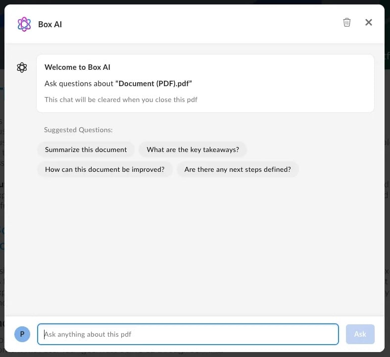
Enable Box AI for UI Elements
To enable the Box AI modal in content preview header, follow these steps:-
Make sure your Node and React versions are
18.xor higher. - Download the npm package that contains Box AI for UI Elements or directly from .
-
Install the peer dependencies:
To do so, run the following command:
Using JavaScript
To enable Box AI features, pass the following:hasHeaderprop set totrue,contentAnswersPropsprop. The fieldsshow,isCitationsEnabled,isMarkdownEnabled,isResetChatEnabledandsuggestedQuestionsare included by default.
Using React component
You can also add Box AI element to a header in a React component. To do so, add:hasHeaderprop set totrue,contentAnswersPropsprop. The fieldsshow,isCitationsEnabled,isMarkdownEnabled,isResetChatEnabledandsuggestedQuestionsare included by default.
To localize the
suggestedQuestions properly, make sure that the prompts are translated. The optional label property is for screen readers, while the prompt property is the text displayed to the user in the AI modal.onAsk, onClearConversations, and onRequestClose.
Scopes
If your application requires the end user to only be able to access a subset of the Content Preview functionality, you can use to appropriately downscope the Access Token to a resulting token that has the desired set of permissions, and can thus, be securely passed to the end user client initializing the Content Preview. Below is a set of UI Element-specific scopes to go alongside Downscoping. These allow developers to enable/disable UI controls on the Content Preview by configuring the appropriate scopes on the downscoped token. To learn more, see .Base Scope
Feature Scopes
Enable highlight annotations with scopes The highlight scope is not included
with
annotation_edit and annotation_view_all scopes. The downscoped access
token will need to include the item_download scope to enable highlighting.